School Project
Class: Design 3104: Intro to Game Design
Members Involved: CJ, Johnson, Jaewook Kwon, Jalen Mundy, Donald Neidecker Gonzales (Myself), Madyson Webb
My Role: Game Designer, Component Designer, Narrative Designer,
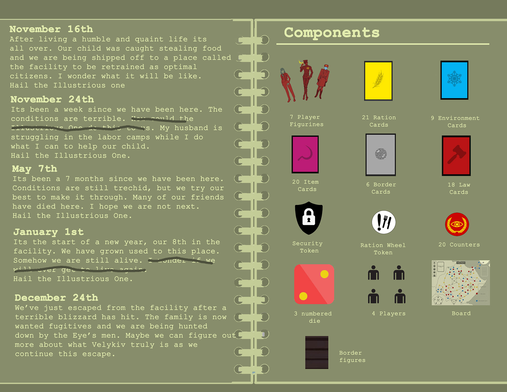
In this project, we were given a theme of 'Winter is Coming' and had to develop a board game around it in 4 weeks. Our group came up with a 3 vs 1 player game about escaping an authoritarian country. It was created as a 3 vs 1 player game so that there could be a collaborative element through the 3 players escaping, but still have a layer of competition since the 3 players had to play against someone. The dictator and his soldiers represented the theme of winter is coming as they were hunting the players.
For the initial concept, the game was originally much more collaborative so players would all work together to escape the country and the soldiers would move on their own until eventually one of the players would draw a card that would turn them into a traitor changing it into a 3 v 1 game. However, this made the game very slow and muddled the gameplay. The objective for the traitor was also unclear.
Since I had less than week to create around 50 cards, I created a very basic template and used placeholder art for the first rendition of them.
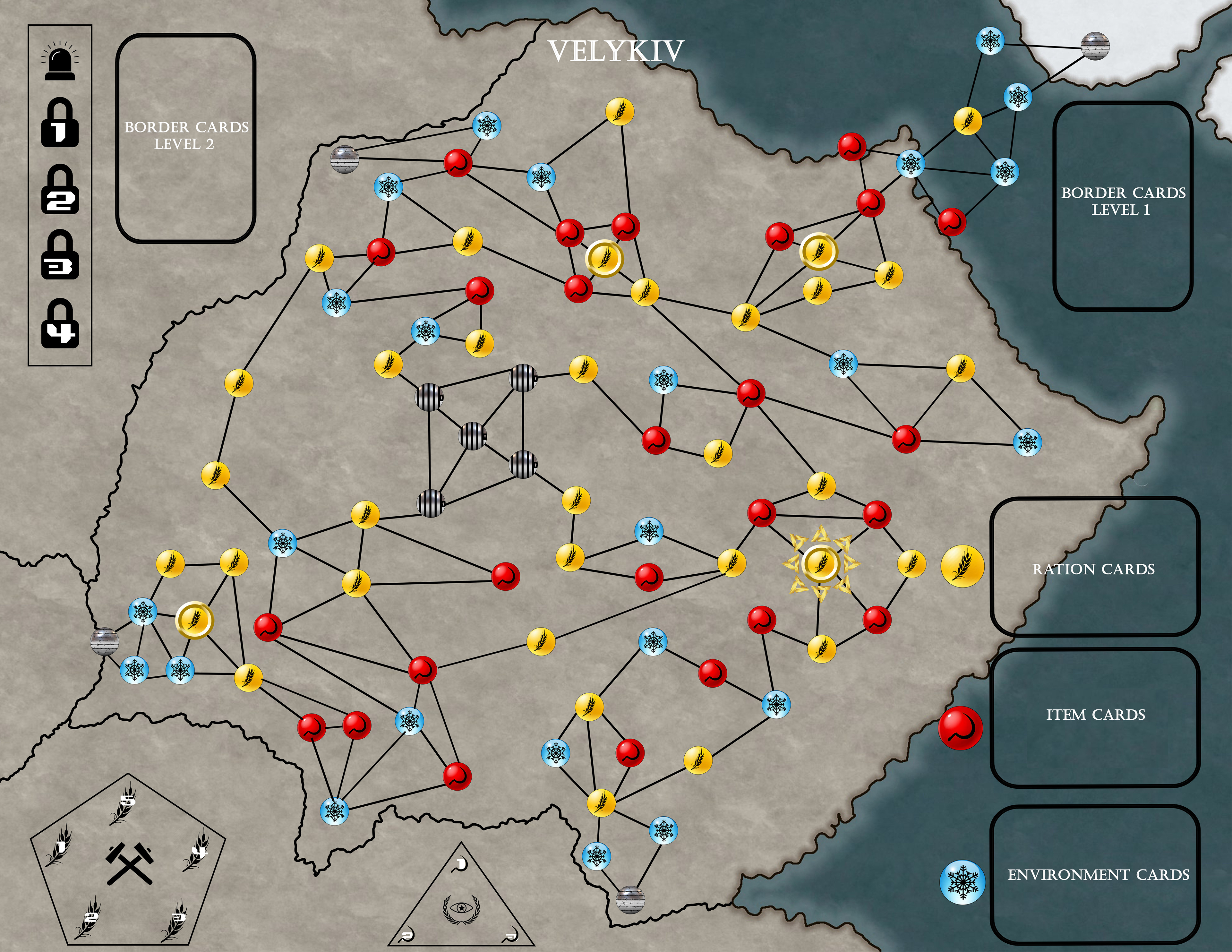
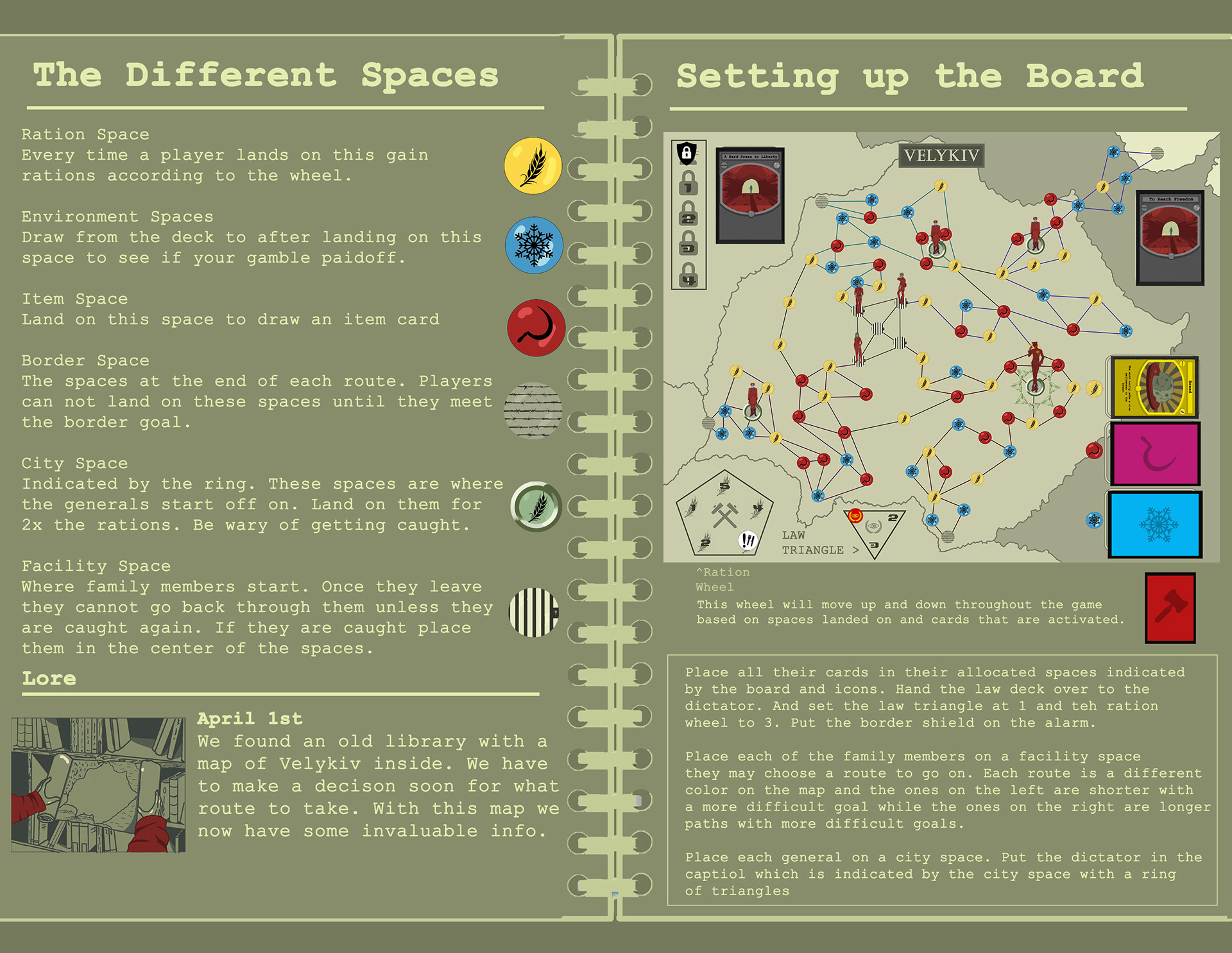
This new version of the board included minor additions such as the inclusion of symbols next to where you would place each card to make set up easier.
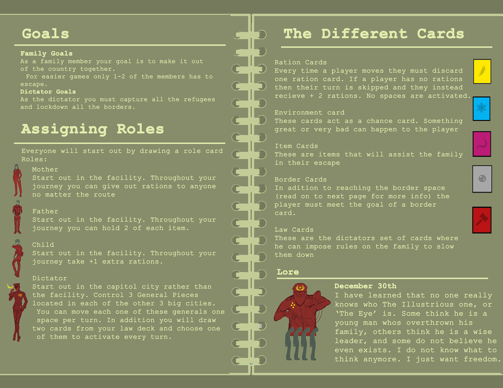
In this next version of the game, our group decided to remove the traitor card and I designed a new role to replace it. While 3 players would play as a family, one would play as a dictator who could control 3 generals trying to capture them using their own set of cards. This cleared up the role of the enemy and made it so the players had to think more carefully about how they played now that they were competeting against a human.

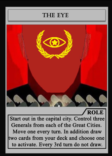
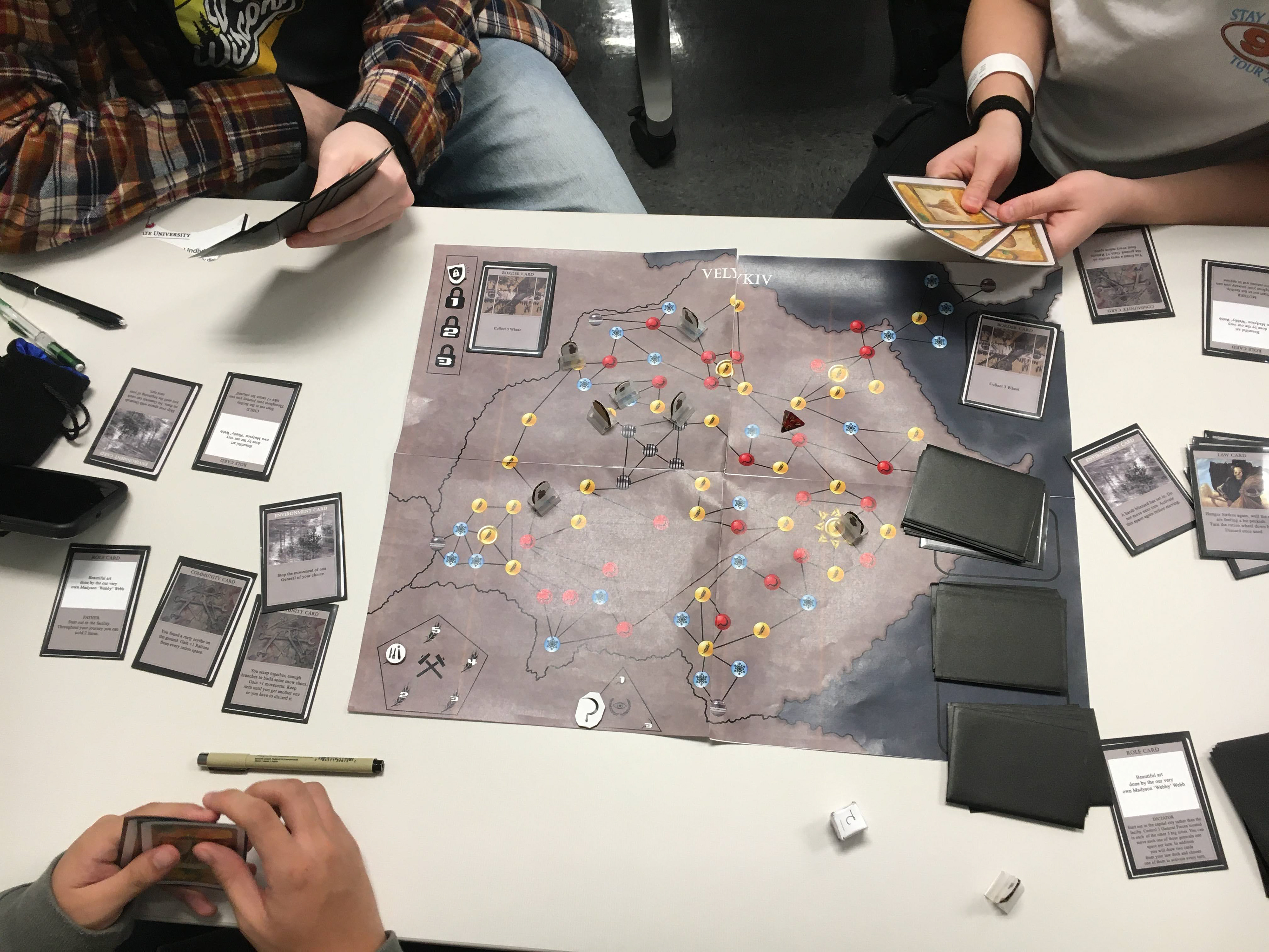
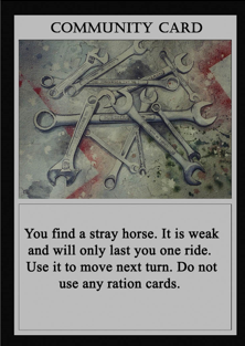
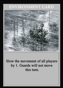
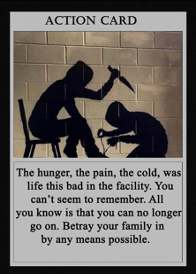
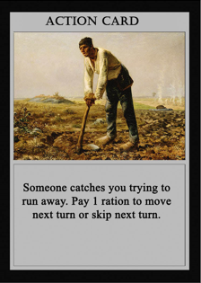
For these new card templates, I colored them to the spot they corresponded to (item, environment, etc.) in order to make set up easier. In addition, I also included a written area as to what type of card they were (law, role, etc.)
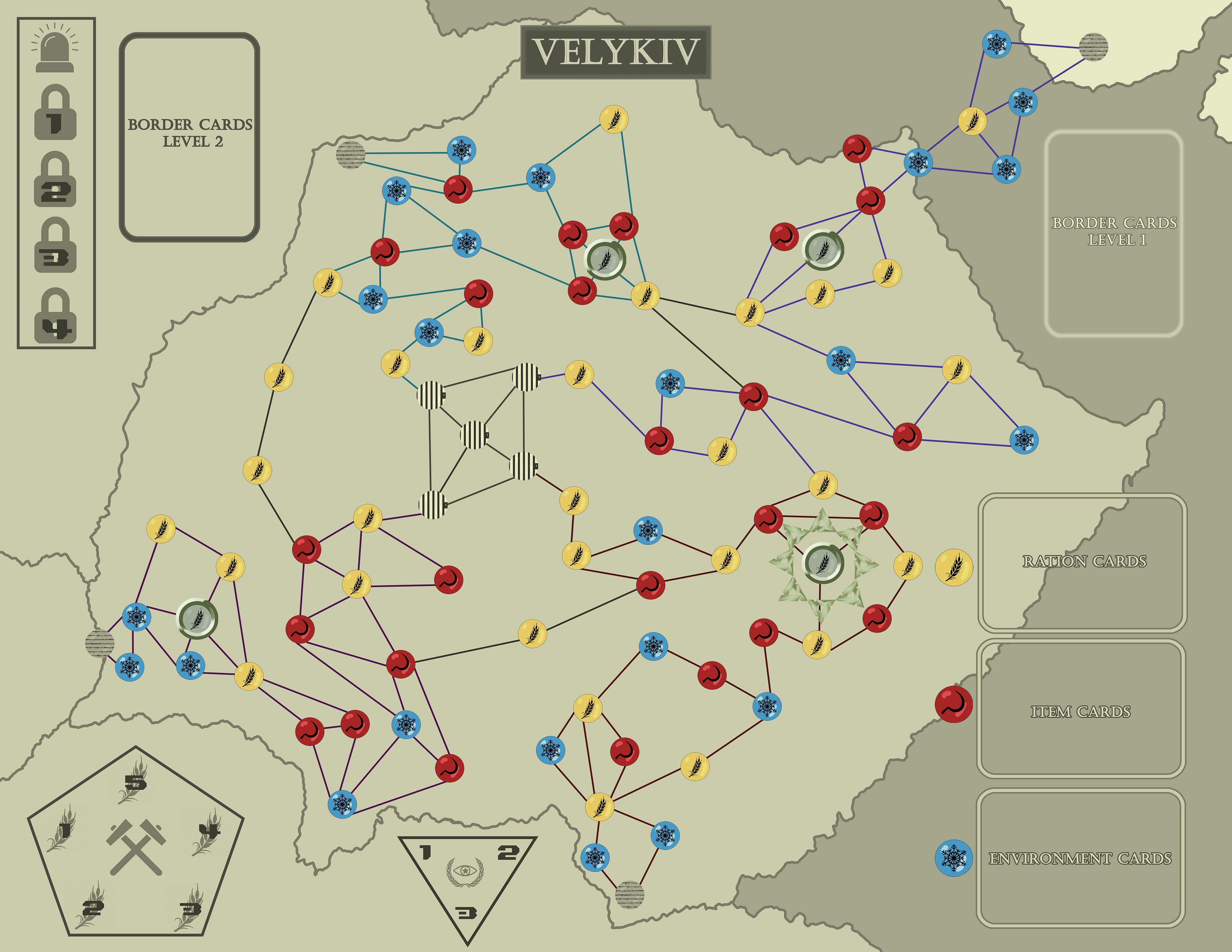
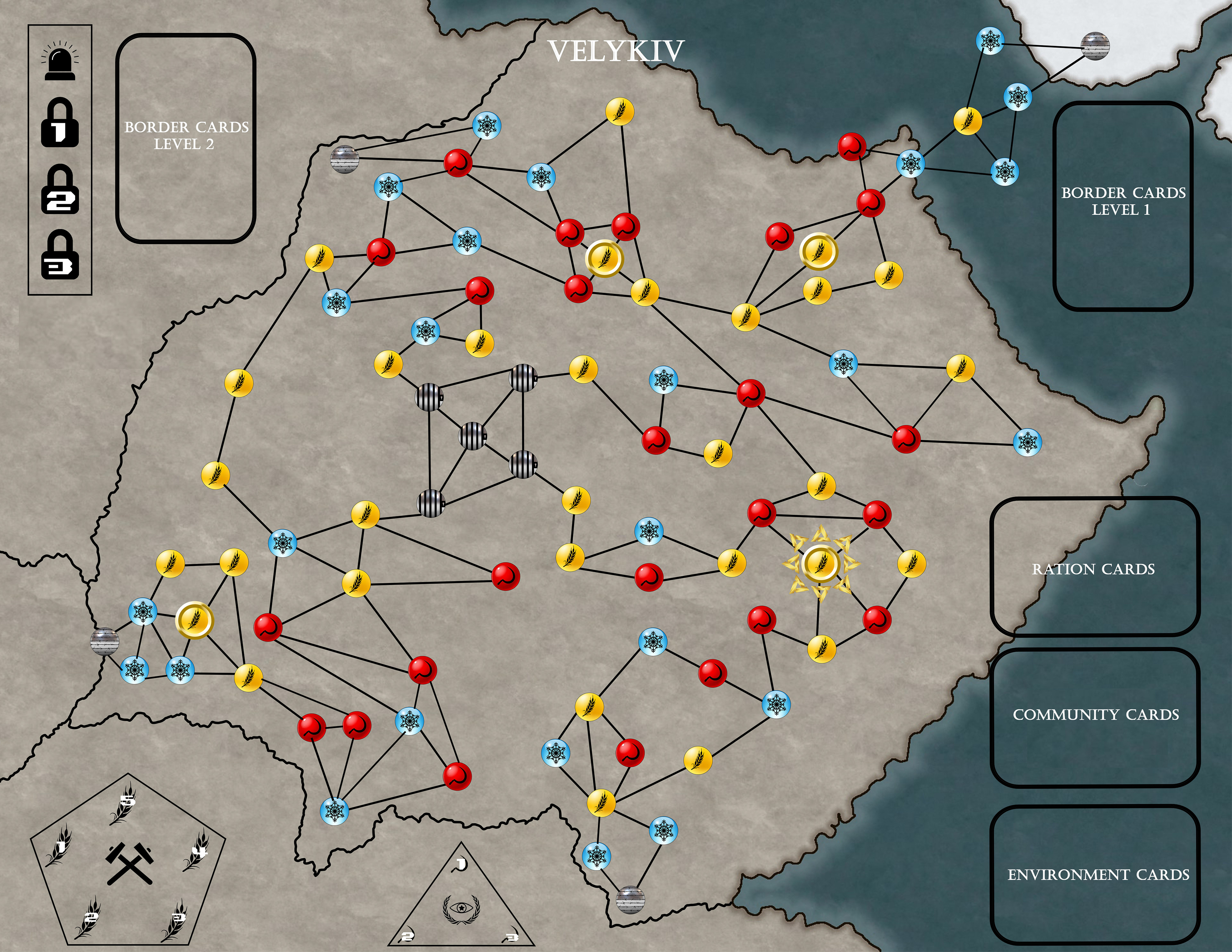
For the final board, I stylized it to fit the drab aesthetic of our game by using dulled out colors as well as different shades of dull green to represent the depressing nature of the country.
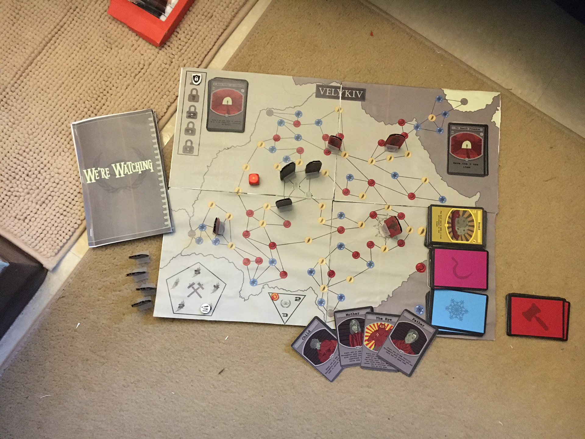
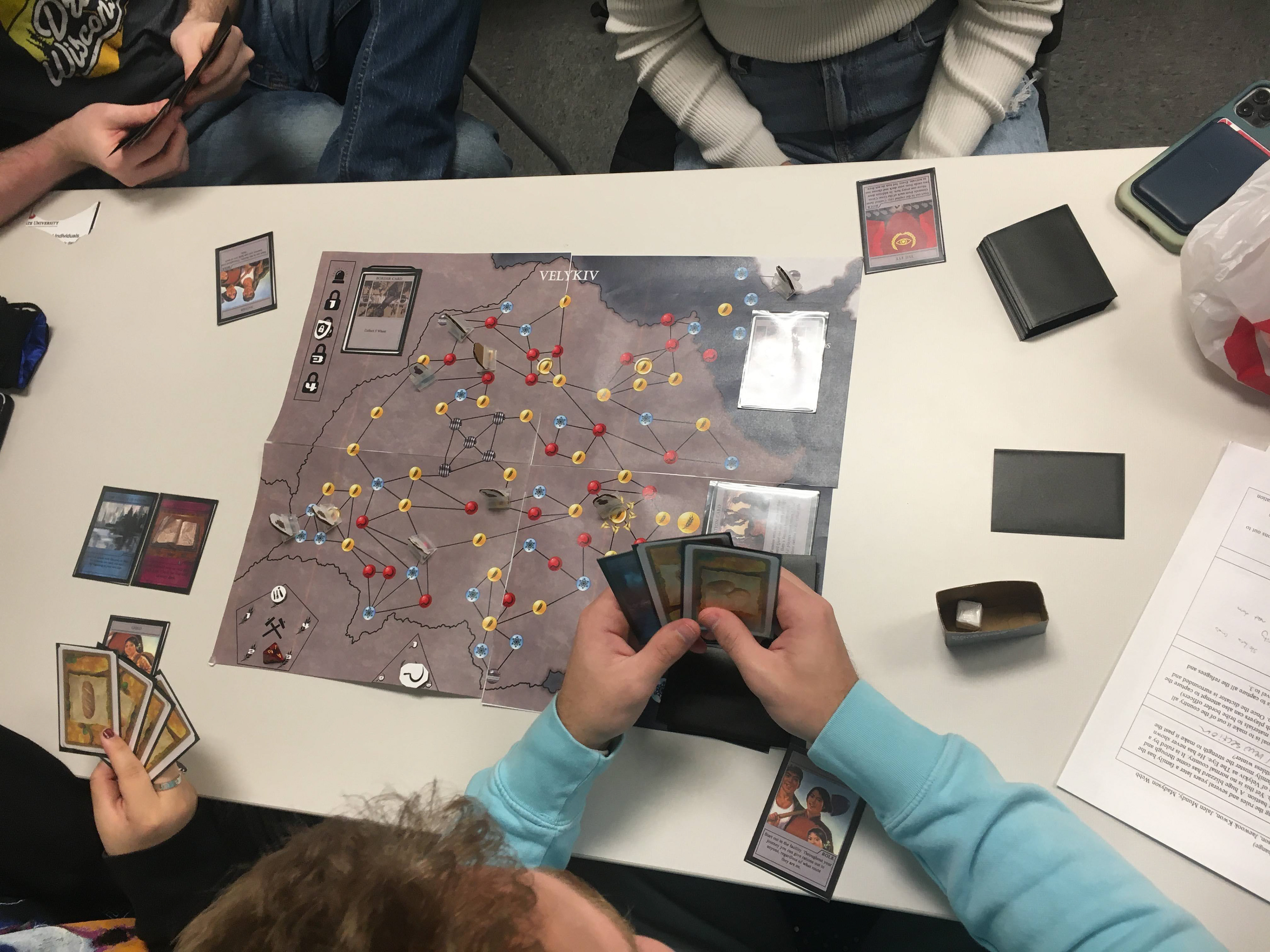
A fully setup game of We're Watching.
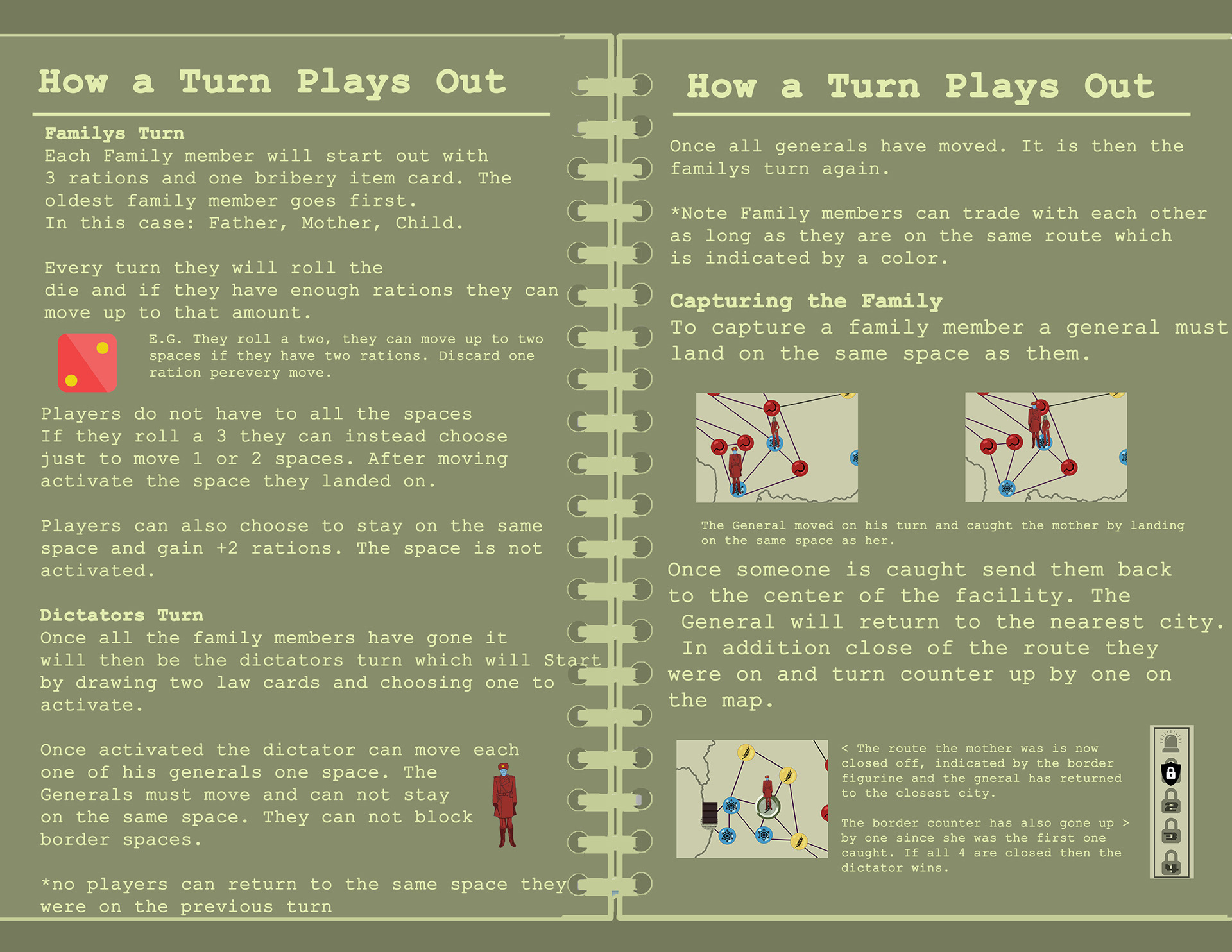
For this final version, our group made sure to try and balance out the roles so even if the one playing as the dictator had more to do, they were not more powerful than those playing as individual family members. One such change was allowing the trading of cards between family members as long as they were on the same route which was indicated by the color of the path.
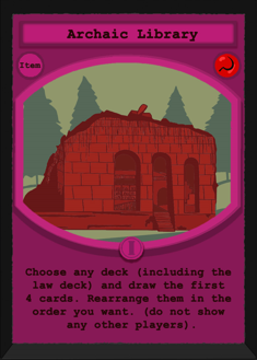
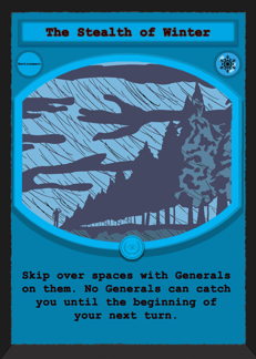
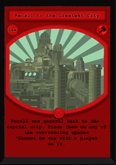
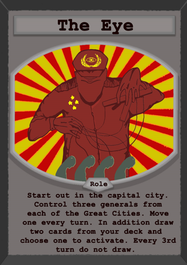
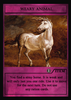
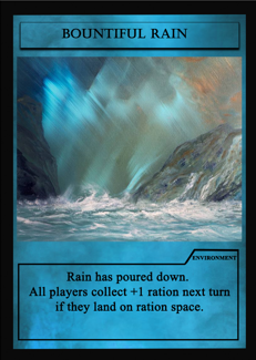
For the final card templates, I designed them to fit the theme of our game by continuing the dull aesthetic as well matching up the card to the space they related to. This included the space icon they corresponded to as well the specific type of card should they be unique through different symbols as seen on the Archaic Library card which is a one use card, hence the roman numeral I. All card art done by Madyson Webb and colored by me.
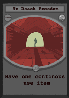

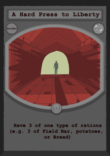
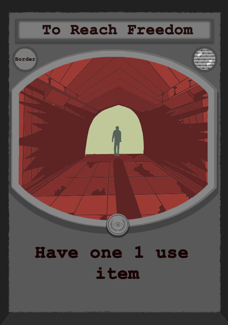
One other notable thing I added in the final game was more unique border goals. This allowed for more replay-ability to the game. Those who took the shorter path in the game had to go through a tougher challenge, while longer paths lead to easier border goals.
I created the manual below to resemble a journal that one of the family members wrote as they were escaping. In addition to the bits of lore scattered across the manual, it also includes traditional elements of a manual such as describing the different types of cards and instructions on other game mechanics.